Research is an essential part of any advocacy campaign. Whether you’re fighting payday lenders or pushing for greater privacy protections, legislators and regulators respond best to data that illustrate the scope and severity of a problem. One of the most effective ways to display data are with maps. Maps make abstract national and state-level averages real by showing the geography of a problem in the places we care about most. Maps are also personal and engaging: every time I see a map of my city, I immediately locate my neighborhood to see how where I live measures up.
The following introduces Datawrapper: a free, no-code, and intuitive tool for making interactive maps and other data visualizations. Our hope is that you make Datawrapper part of your advocacy toolbox in your campaigns to protect consumers.
What is Datawrapper?
Oftentimes, our data have a geographic component like state or ZIP code. Advocates tend to think that they need to have specialized expertise in a tool like ArcGIS to make maps and analyze these data, but this isn’t the case! Enter Datawrapper: a free[1], no-code, and intuitive tool for making interactive maps and other data visualizations. Everything in Datawrapper is done in your web browser, meaning there is not software that needs to be downloaded. At CFA we frequently use Datawrapper to build maps maps on our website, as illustrated in the examples below.
What are some examples of Datawrapper maps?
Datawrapper is used by many organizations such as The New York Times and The World Economic Forum. CFA has leveraged Datawrapper many times such as:
- Mapping the “credit penalty” (how much more consumers pay for home insurance simply for having a lower credit score) for each county in the United States
- Mapping which states prohibit the credit reporting of medical debt
- Mapping overdraft complaints for Navy Federal Credit Union by congressional district after the Russell Vought-led CFPB dismissed previous enforcement action
How can I make maps in Datawrapper?
Making maps in Datawrapper is easy – no degree in statistics required! To use Datawrapper, you will first need to sign-up for a (free) account. An account will allow you to save all your maps in one place.
In the below walkthrough, we will map consumer complaints by ZIP code in Rhode Island in five simple steps. The data come from the CFPB Consumer Complaint Database. After the data was filtered for Rhode Island and downloaded from the CFPB website, it was grouped and tallied by ZIP code. This can be done with a Pivot Table in Excel. Our data is named “cfpb_complaints_ri.csv” and has two columns: “ZIP” and “number_complaints.” It can be downloaded below.
1. Select the type of visualization
-
- Datawrapper can be used to make many different types of data visualizations (scatterplots, bar charts, etc.) and tables in addition to maps. But here we are focused on mapping!
- To create a new map, select “Create New” and then “Map” on the top of the Dashboard
- Datawrapper allows three different kinds of maps: choropleth, symbol, and locator
-
-
- Choropleth maps are the most common: they are also known as “heatmaps.” We will make a choropleth map in this walkthrough.
- If we wanted to make a “Symbol map” instead, the number of complaints in each ZIP would be represented by the size of a symbol (like a circle) rather than filled in with a certain color
- Click on “Choropleth map”
-
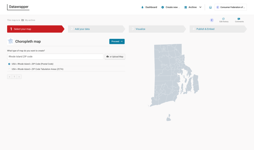
2. Select your map
-
- Next, we need to select the map that matches the format of our data. Since our data are organized as a count of complaints per ZIP code in Rhode Island, we need to select a map of Rhode Island ZIP codes
- To select Rhode Island ZIPs, type a search term like “Rhode Island ZIP code” in the search box and select “USA » Rhode Island » ZIP Code (Postal Code)” from the results
- There are thousands and thousands of maps available, for essentially any geography you can think of. You can map towns, school districts, congressional districts, state legislative districts, and much more. You could even map police precincts in New York City if you wanted!
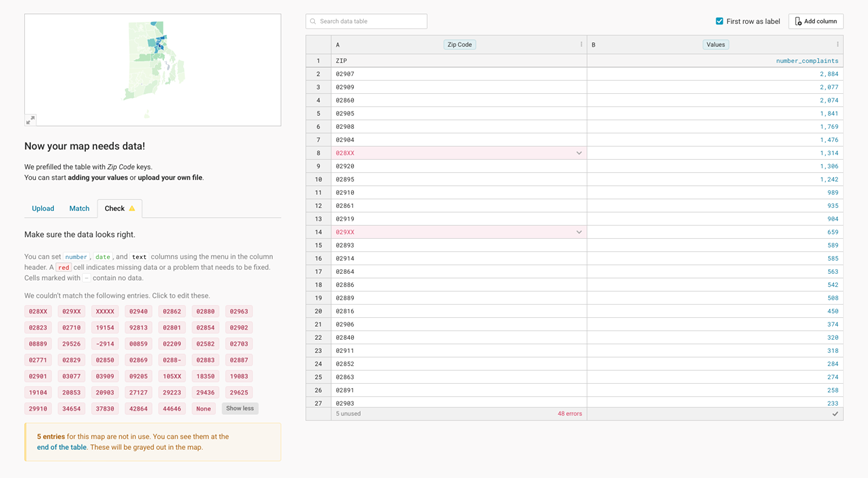
3. Add your data
-
- Now, we need to add our data that we want to map
- There are multiple ways to add data including copying and pasting or linking to an external Google Sheet. Here – since our data is saved locally as a .csv file – we will upload it with the “Upload file” button
- After we’ve uploaded our data, we need to verify that it was done correctly. To do so, click on the “Check” tab. Datawrapper will let us know if there are any errors.
- In our example, we see that some of the ZIP codes in our data do not align with ZIP codes in Rhode Island. This occurs for a few reasons:
-
-
- When submitting their complaint, a consumer mistyped their ZIP code
- A consumer did not include a ZIP code in their complaint (“XXXXX”)
- A consumer only included a 3-digit ZIP rather than their full 5-digit ZIP for privacy reasons (e.g., “028XX”)
-
-
- Additionally, some RI ZIPs are missing in our data. This is because consumers in these ZIP codes have never submitted a complaint! If we wanted to, we could manually enter a “0” next to each grayed-out ZIP code in the table.
4. Visualize
-
- Next up is the fun part – customizing how our map looks!
- There are dozens of options that can’t all be covered here. Let’s focus on a few common ones:
-
-
- Adding a title
-
-
-
-
- To add a title, click on the “Annotate” tab and enter a title in the “Title” textbox
- Here, we’ll name our map “CFPB Complaints in Rhode Island”
- Alternatively, we could also click on the title in the map to edit it
- Adjusting the scale
-
-
-
-
-
- Since some ZIP codes have many complaints (over 2,000) while others have very few (2), the default continuous scale is unbalanced
- Instead of a continuous scale, let’s use a step scale where the number of complaints in each ZIP code is assigned a bin (i.e., 1-500 complaints, 501-1,000 complaints, etc.)
- To do so select “Steps” under “Type” in the “Refine” tab and then “Rounded values” under “Steps”
- Note: Since ZIP codes vary greatly in population, in practice we would want to map complaints per capita rather than the raw number of complaints
-
-
-
- Editing the pop-up window
-
-
-
- When we hover over the map, the default pop-up window is uninformative. We know that the numbers in bold are ZIP codes and the values below this are the number of complaints, but would someone briefly looking at our map for the first time know this?
- To customize the pop-up window, click on the “Customize tooltips” in the “Tooltips” section in the “Annotate” tab.
- The %REGION_NAME% and %REGION_VALUE% are how Datawrapper refers to the ZIP code and number of complaints variables, respectively
- Let’s add labels to these variable values by changing %REGION_NAME% to “ZIP Code: %REGION_NAME%” and %REGION_VALUE% to “# of Complaints: %REGION_VALUE%”
-
-
-
- Allowing data downloads
-
-
-
- One neat feature of Datawrapper is that you can allow users to download the data underlying your map, if they’d like to further analyze it themselves
- Under the Layout tab, make sure “Data download” is toggled on in the “Footer” section
-
-
5. Publish & Embed
-
- Finally, it’s time to share our map!
- To do this, we first need to publish our map. Clicking “Publish now” generates a unique web link that you can share
- After you publish, you can download a picture of your map as a PNG file or – best of all – embed your map on a web page (where it will be interactive) like this:

Bonus: How Do I Link Geographies?
In our walkthrough above, we mapped ZIP codes because this variable was available in the CFPB Consumer Complaint Database. But what if we wanted to map a different variable, like Rhode Island counties?
In general, we can always link smaller geographies (e.g., census tracts) to larger geographies (e.g., counties) – but not the other way around – so long as we have a crosswalk file. A crosswalk file matches the geographic variable that we have to the geographic variable that we are interested in. If the geographic variable that we have is fully nested within the geography we’re interested in, there will be a one-to-one relationship. If the geographic variable that we have overlaps the boundaries of the geography that we’re interested in there will be a one-to-many relationship. The figure below shows how common Census geographies nest (or don’t nest) within each other.
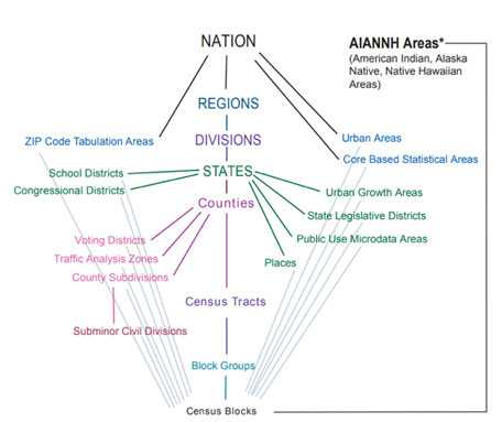
Source: Walker, K. (2023). Analyzing US Census Data: Methods, Maps, and Models in R (Online). CRC Press. https://walker-data.com/census-r/index.html
When a smaller geography matches two or more larger geographies (i.e., one-to-many relationship), one common solution when linking is to calculate a weighted average. The crosswalk files often contain information on the proportion of the smaller geography in the larger geographies by land, residents, businesses, etc. that can be used as weights. For example, let’s say you want to link ZIP code A with 1,000 consumer complaints to the county-level, but it belongs to two counties: County B and County C. We know from the crosswalk that 70% of ZIP code A’s residents live in county B and the remaining 30% live in County C. So, when tabulating the number of complaints by county we assign 700 (70% of 1,000) complaints to County A and the remaining 300 to County B. This assumes that the number of complaints is distributed throughout the county by population, which is a fine assumption to make in most cases. Just note in your write-up that it is an estimate.
Crosswalk files are available from many sources such as the Census Bureau and the Missouri Census Data Center Geographic Correspondence Engine. Crosswalks for ZIP codes are published each quarter by HUD and can be downloaded here.
Conclusion
Lawmakers, regulators, the media, and other stakeholders are best convinced when our arguments are backed up by data and research. Maps are an engaging and effective way to visualize our data when it contains a geographic variable like county or ZIP code. Datawrapper is a free, no-code, and intuitive tool that any consumer advocate can use to build interactive maps – no data background necessary! We hope that you add Datawrapper to your advocacy toolbox for your campaigns to protect consumers.
-
- [1] There is a paid version of Datawrapper, but the free version has all the capabilities you need. The paid version is aimed more towards large organizations like the New York Times that need a customized “look” for their maps and graphics. CFA uses the free version of Datawrapper!